


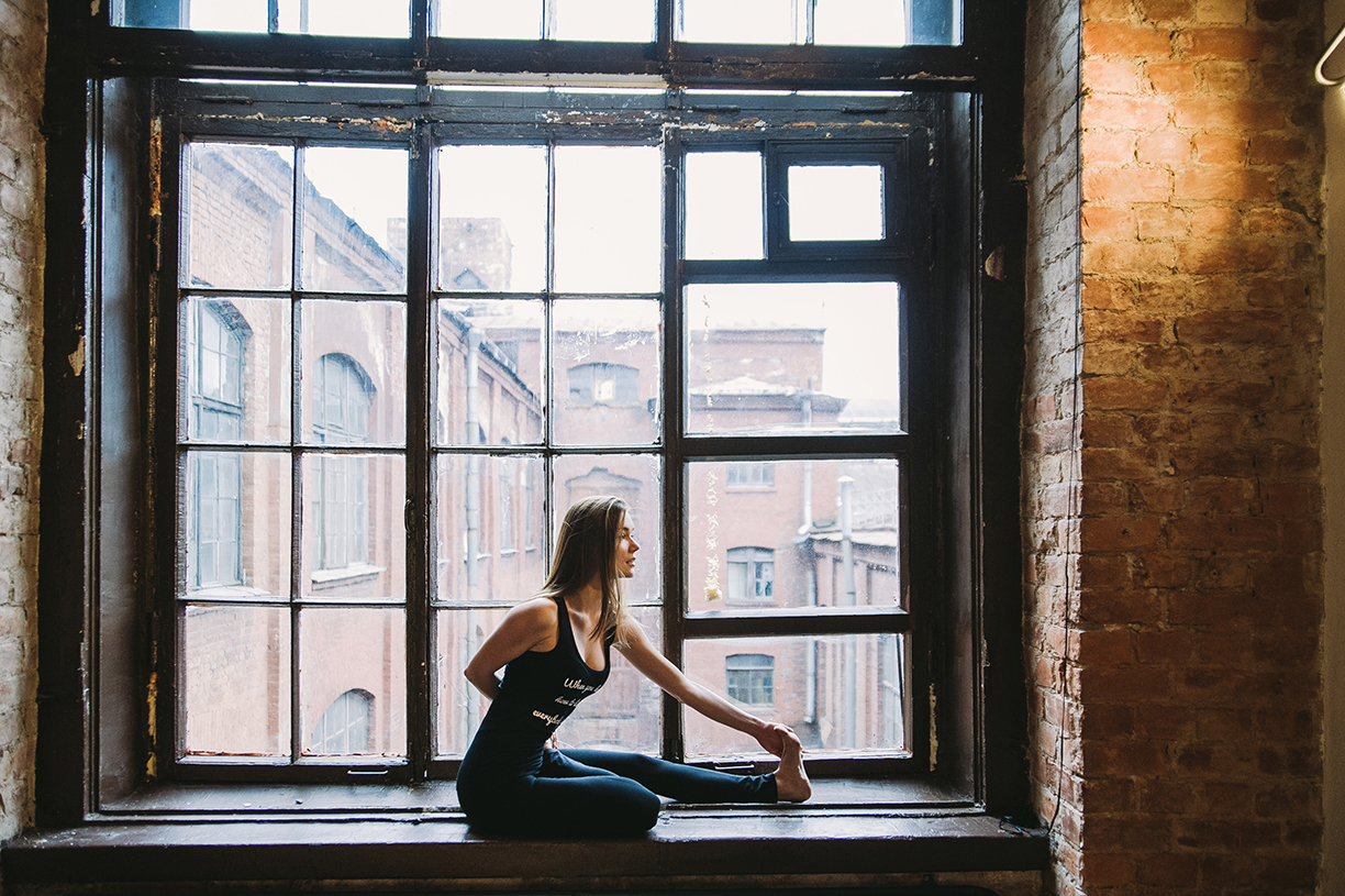
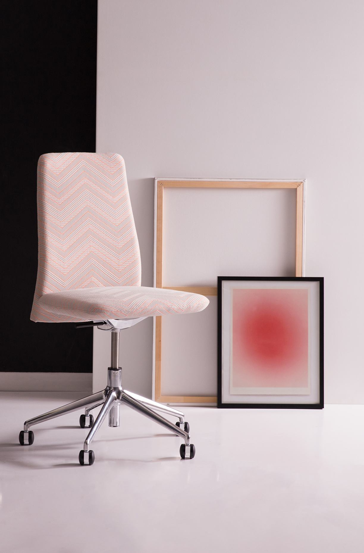
Photo by Alem Sánchez.
With literally millions of shades and hues to play with, color can also be intimidating. In a recent post by Northeast Meetings + Events, a series of experts give their professional advice on how to utilize color to enhance an entertainment venue and decoration. Fulfill the entertainer in yourself with their insight!
Expert advice varies on if there should be a color limit or if there’s a perfect strategy to picking colors. But when you do, internationally recognized color expert Leatrice Eiseman suggests starting with one lead color. “Then build the other colors around it.” And always take into consideration the existing room’s colors and lighting. “Whatever the venue is you’ve got to take into consideration what is already there that is immovable. What could you do to draw attention away from or disguise a presence of color that really is interruptive?”
As Director of the Eiseman Center for Color Information and Training, and the executive director of the Pantone Color Institute, Eiseman definitely has the know-how on color. She says that early in her career people outside of fashion didn’t pay much attention to color. “When I started out I’d often meet with a bunch of engineers sitting there with crossed arms,” she says. “But people have realized the psychological impact color has. … Color is a very important aspect of any work you do across design industries.”
When using color in decor, for events or otherwise, consider the mood you want to establish.
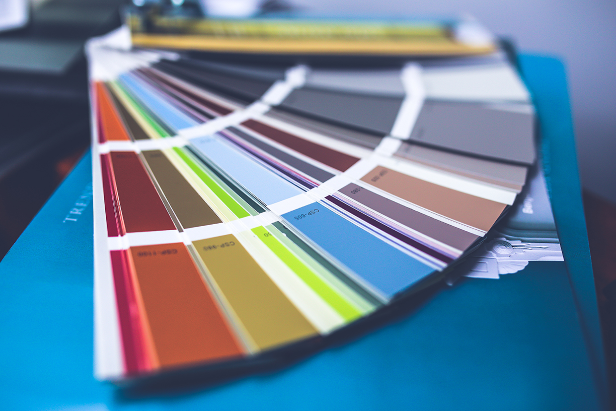
Photo by Kaboompics.com
“The use of cool colors and hues such as blues can help calm and relax individuals and generate clearer and a more relaxed mind-set, great for business sessions,” says Sarah Kelly, senior event producer with Cantrav Services. She often incorporates color to set a mood. “While the use of warmer colors and hues such as ambers and reds can help stimulate and generate a more active and warm response, great for team-building or brainstorming sessions,” she adds.
Photo by Pixabay.
Photo by Designecologist.
You can even use color to play off of factors such as the season of the event, suggests Dwayne Thomas, owner of Portland lighting company Greenlight Creative.
“There are some perennial things. If I do a fundraiser in the fall, there’s a 50-50 chance it’s going [to show] fall colors. In winter, blues tend to be more popular, and in the summer, reds are more popular.”
“Color adds an additional depth and sparks interest,” says Kelly, who suggests that planners be bold and purposeful — but not too bold. “There are two mistakes people can make, either using too much color and overwhelming guests’ senses or being afraid to use it at all and not fully committing to the event’s theme or identity,” she says. “But, as long as you stick to some basic rules such as making sure you use colors that complement one another … there’s no reason to go wrong.”
For more color tips, visit Northeast Meetings + Events post!
For many industries, working from home has become the norm and the need to create a productive work environment is at the forefront of the minds of young professionals.
What better way to increase productivity than to outfit the perfect office space! Design professionals at Home Design Ideas have found some of the best and easiest ways to help you find your office style, so that the real work can follow. Whether you’ve got an entire room or just a tiny corner, this list should help spark the imagination!
Minimalism
Minimalism has been a consistent trend that works its way into many highly sourced styles, from Hygge to Transitional. For offices in particular, minimalism is key as it wards against clutter and helps promote a clear mind.
To keep your desk clutter-free, add in simple furniture and some shelving. Embrace a neutral color palette to really showcase the minimalist in yourself, and if you need to warm things up to avoid getting too stale, incorporate a touch of green with a plant or pieces of art.
This is the better way to keep it simple, clean, and perfectly in order.
Photo courtesy Pixabay.

Black Goes with Everything
Much like its effect on wearable fashion, black happens to go with almost anything, from brass accents on black furniture to gray-black paint as an accent wall.
Using black is an easy, yet stylish method of design for those who want their office style to look effortless (because it was!). There are tons of ways you implement black color, including the utilization of fun prints.
“To totally transport yourself somewhere way more exciting than your work, try an exotic pattern, like the black-and-white zebra motif. A rattan chandelier adds texture and personality to the space,” according to Home Design Ideas.
Photo courtesy Pixabay.
Boho a Go-Go
Bohemian, like other classic styles, is one that is timeless and free spirited in nature — a perfect setting to give your mind a rest after the work is done.
Embrace your inner free spirit and decorate your office with anything that tells a story, has sentimental value to you, or that you picked up on your travels.
Often times these pieces are little motivational tokens, a reminder of what success and productivity lead to.
Add in a bold, patterned rug, color on color, and some plants to add to this overall energy.
For other tips, visit Home Design Ideas post here!
Photo courtesy Daria Shevtsova.
No matter the lifestyle, wellness and the pursuit to live better has been a rising trend in today’s world. In 2018, Pinterest reported that searches for “self care” were up 140 percent year-over-year, with no mention of stopping. Recently surveyed by national paint brand Sherwin-Williams, homeowners and professional interior designers have also noticed this uptick in wellness and how it affects modern home design and décor. Looking to make your spaces “healthier”? Check out these recent trends to see how you can incorporate wellness into your home styling.
Self-Caring for Your Space
People are taking self-care beyond their body and into interiors. According to the survey, nearly 42 percent of designers say they have been asked to incorporate self-care into their designs. Twenty-nine percent of homeowners also take self-care into consideration when decorating their home.
The most popular way to bring wellness into a space also happens to be one of the easiest — natural light. Eighty-seven percent of designers use natural light to effortlessly reflect wellness.
Photo by Daria Shevtsova
Breathe It In
Improving indoor air quality is key for homeowners and designers looking to make changes. Over 54 percent of homeowners cite air quality as away they bring wellness into their homes, and 58 percent of designers use it as a tool to incorporate wellness.
Limiting volatile organic compounds, or VOCs, that are released through building materials is one of the best ways to improve air quality. This is done by using lower-VOC paints and other home improvement products that are sustainably sourced and have a low-carbon footprint.
Photo by Anamul Rezwan.

Color
When it comes to color, designers and homeowners do not see eye to eye on their top color choice that represents or stimulates wellness. Nearly 41 percent of designers say that green associates the most with wellness, whereas 34 percent of homeowners believe this color to be blue. Another popular color is white/gray, which 11 percent of designers and 18 percent of homeowners associate with the trend.
The color least likely to be associated with wellness? Red. Not a single designer and only 1 percent of homeowners reported that they associate this hue with wellness.
Photo by Pixabay.
Total Zen
In regard to specific spaces that are designed to promote wellness, homeowners different on their choice of which space was the best to achieve “total zen.” The top choices included a gym/fitness room (41 percent), a reading room (41 percent), and a greenhouse (38 percent). These choices differed from designers, who say that the most popular wellness rooms they’ve been asked to design in the past year include a reading room, a sauna/spa, a gym/fitness room, or a meditation room.
No matter the space, these insights into the wellness trends of today may better help you to find the wellness you crave from the comfort of your own home.
Photo by KatjaFiona.
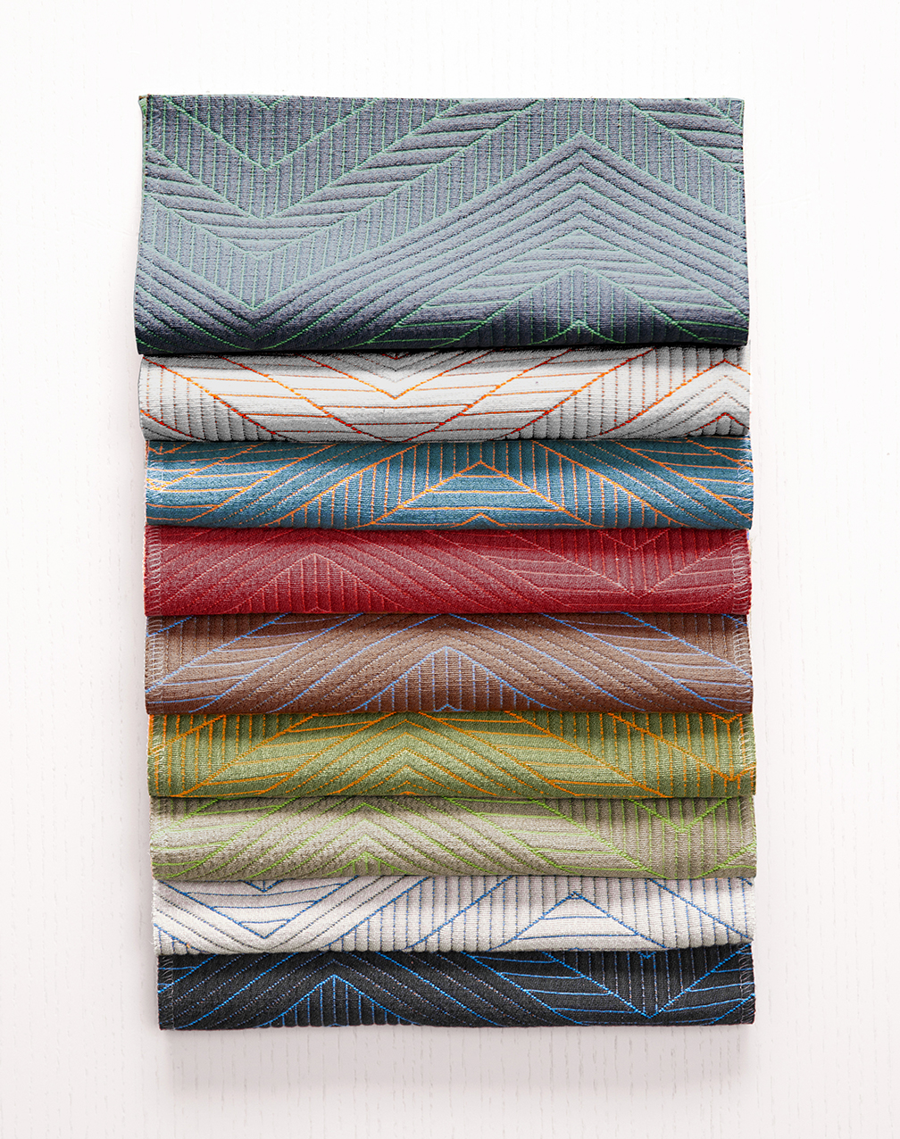
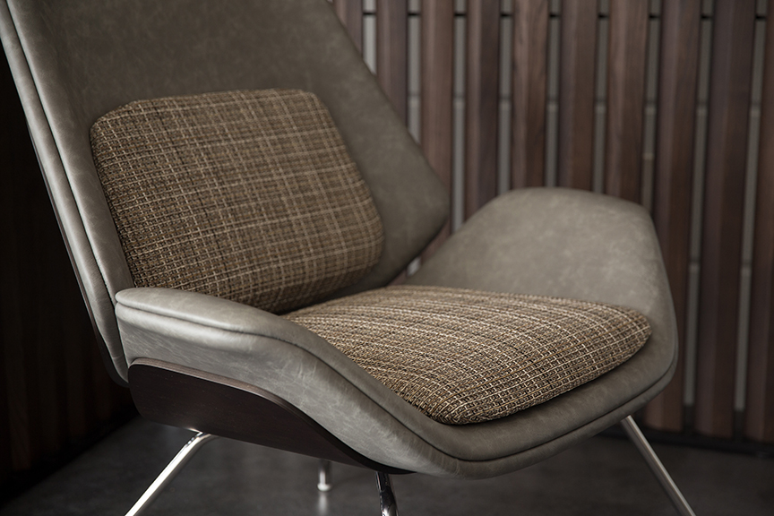
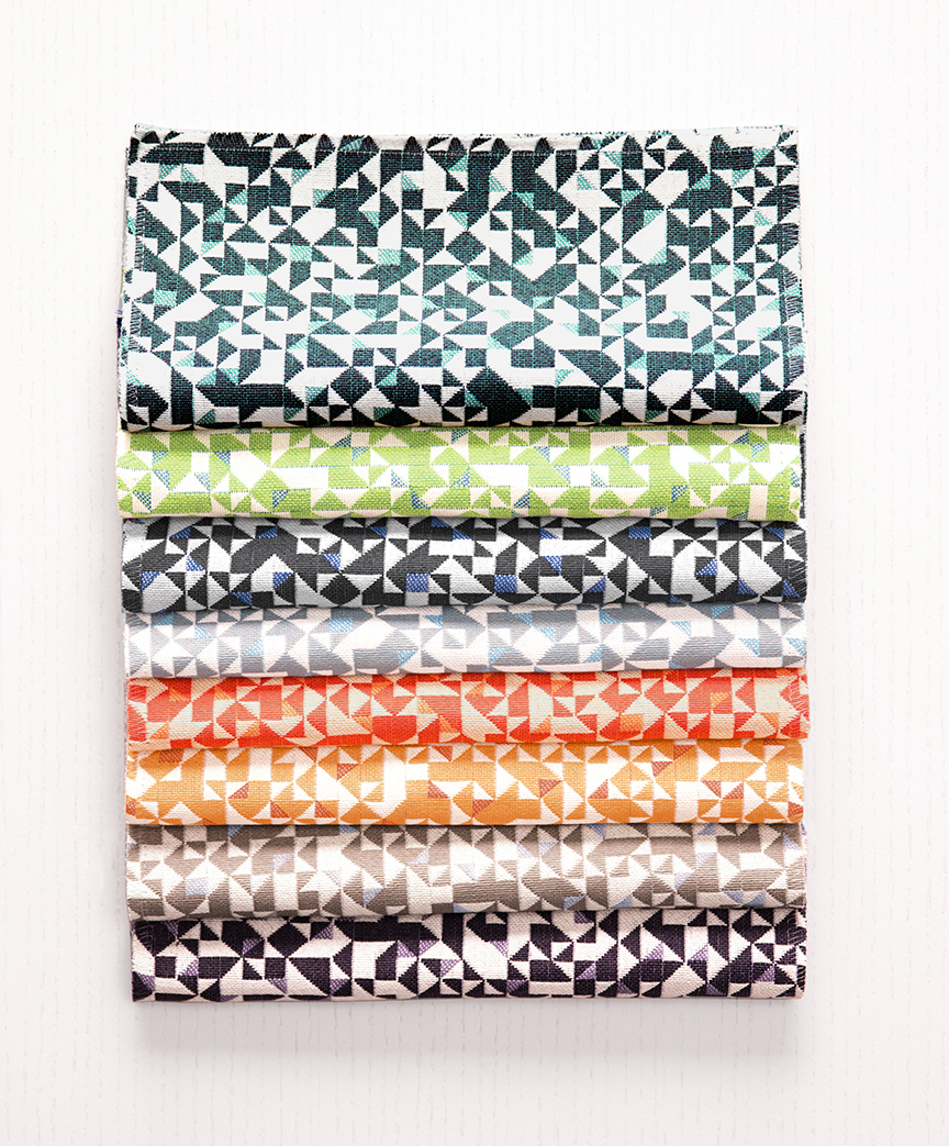
Building on the success of some of its best-selling designs, while crafting soon-to-be favorites, HBF Textiles’s latest introduction of the Spring 2019 Collection is a double-take on its own history as it looks forward.
Featuring six fabrics, including two reissues of popular brand classics, the brand looked to the individual patterns present within fibers to craft a tactile, visual collection. Unique weave constructions are utilized with matelassé, knotted cord floats, waffle weaves, and a well-worn saddle leather, making Spring 2019 a multi-dimensional line that closes the gap between new and old, classic and original.
“Our Spring 2019 collection is a reimagined look at HBF Textiles’ history and where we’re headed,” explains Mary Jo Miller, HBF Textiles VP of Design & Creative Direction. “The line combines some of our most memorable textiles with modern, distinct designs to create something entirely new. Spring 2019 looks boldly ahead while still managing to feel timeless, classic, and thoughtful.”
Two updated classics, Honest and Moving Forward, prove their enduring design with modifications and additions that embrace their roots.
Moving Forward
First launched as “Moving Blanket” by Elodie Blanchard for HBF Textiles in 2014, the renamed textile Moving Forward was inspired by the beauty of a moving blanket draped over a piece of furniture, translated into upholstery. The 2019 version offers neon fill yarns for an added pop of color and original look.
This textile takes the original artwork from Elodie Blanchard’s ‘Moving Blanket’ and propels it into a vibrant, new direction with neon weft yarns peeking through the matelassé pockets. The fabric comes in nine dynamic iridescent hues with a stain resistant finish.
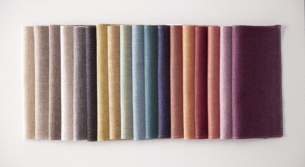
Honest
For Honest, first released with Christiane Müller in 2016, a fresh range of modern, heathered colors add depth to this timeless pattern and expand on its initial design. Woven at a family owned mill in Italy, Honest features a hybrid of fibers that when blended look and feel like a soft wool blanket. It’s featured in eight heathered combinations, as well as the original 10, for a total of 18 colors that impart depth and clarity.
The Honest color family is also growing! New exciting shades from Christiane Müller are expanding this simple and beautiful solid texture.
The four new additions to the HBF Textiles family — Grateful Grid, Wild West, Caddy Corner, and Vault Lights — bring liveliness and diversity to the collection through bold grids, distressed leather, small-scale angles, and geometric patterns.
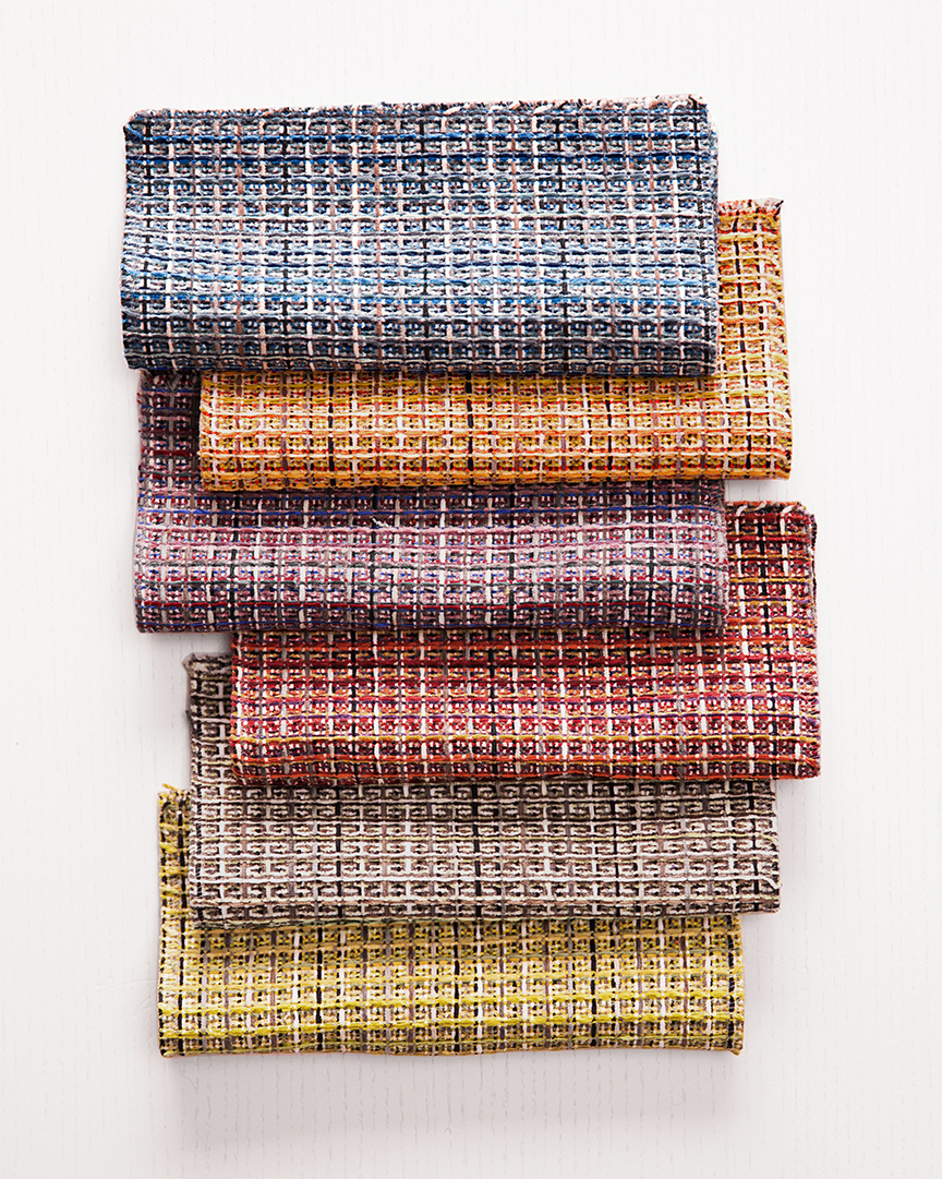
Grateful Grid
Crafted at an intimate mill in Germany where chenille is the dominant fiber type, it’s easy to feel grateful for this bold grid weave comprised of soft chenille yarns.
Grateful Grid is a waffle weave structure which allows air to flow and sound to be captured. The six vibrant shades are named for the first word in a variety of Grateful Dead song titles.
Caddy Corner
Kitty Corner, Catty Corner, Cattywampus — whatever works for you on the diagonal.
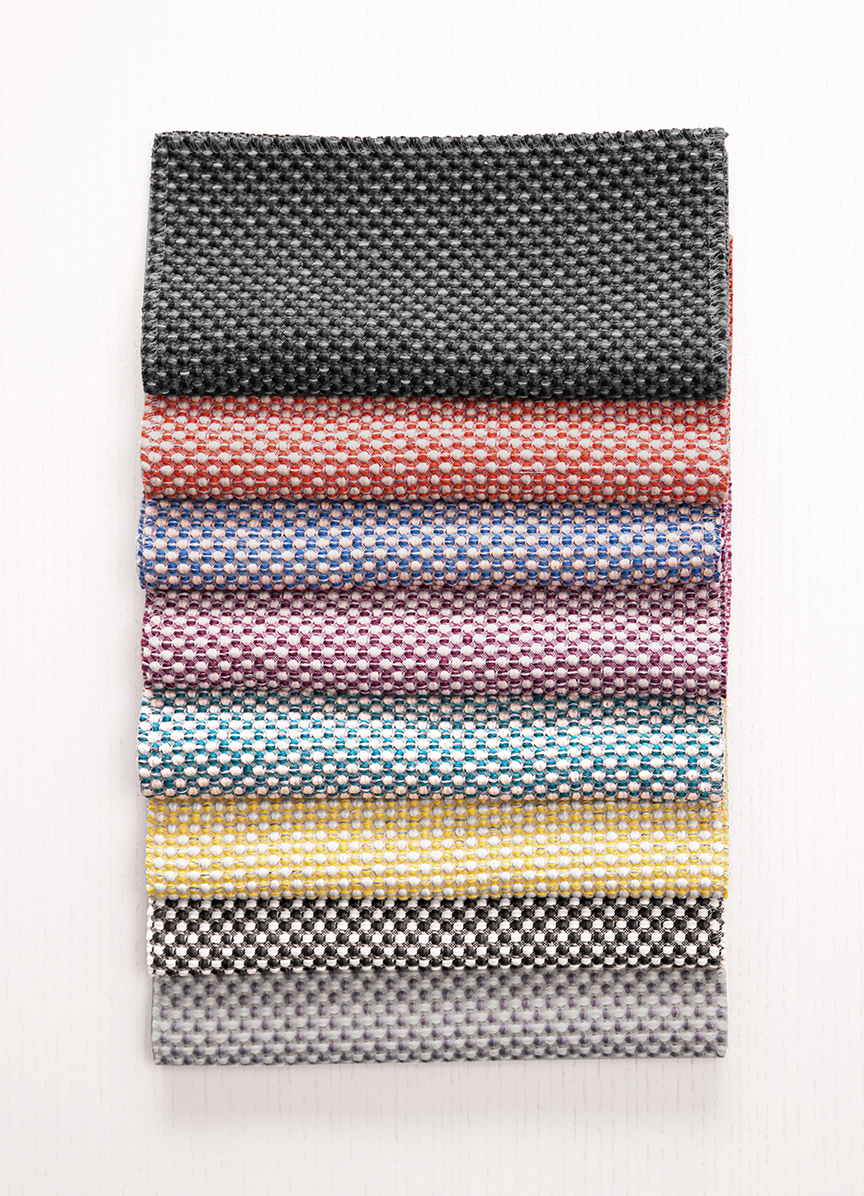
Caddy Corner is the odder spelling and takes it cue from small scale 45-degree angles. The eight multi-hued fabrics all showcase playful colors, while remaining composed of 58.5 percent post-consumer recycled polyester — one of the brand’s most sustainable fabrics.
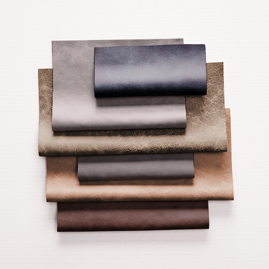
Wild West
Wild West’s distressed leather features a scratch-resistant surface with a matte finish, like a well-worn pair of cowgirl boots. The finish allows it to be specified for high traffic areas, while showing off a chic, marbled, crackled appearance. There are six complex shades, each named for a famous cowgirl from early western classics.
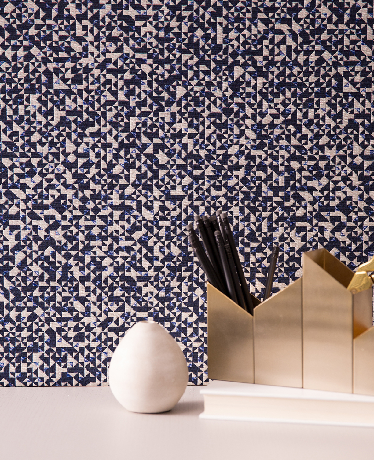
Vault Lights
Vault Lights was inspired by the geometric refraction of skylights with their bumpy quality and jewel-toned hues. Woven in Germany, the textiles come in eight luminous colors that represent the look and dimension of light prisms through glass.
Images courtesy HBF Textiles.
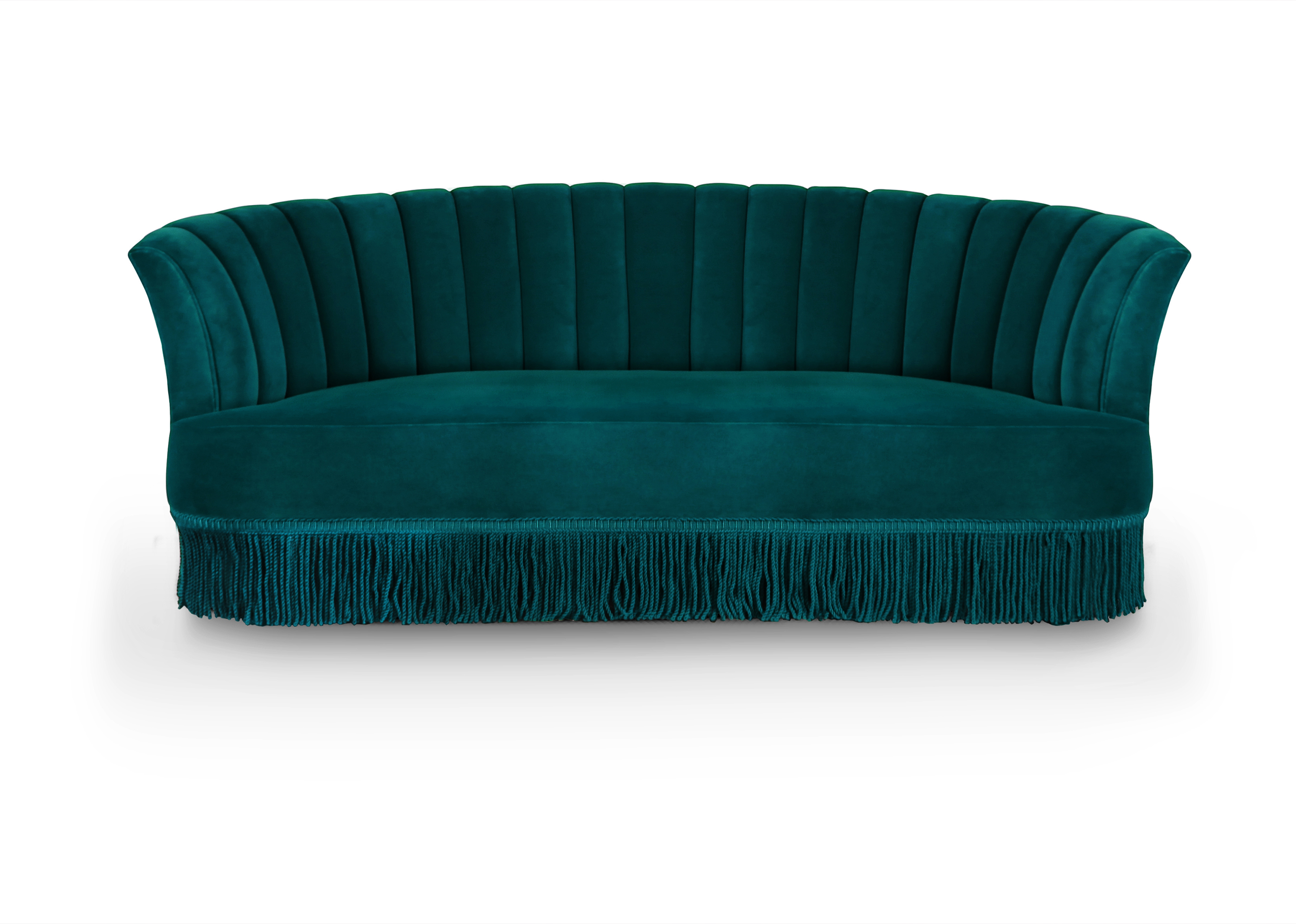
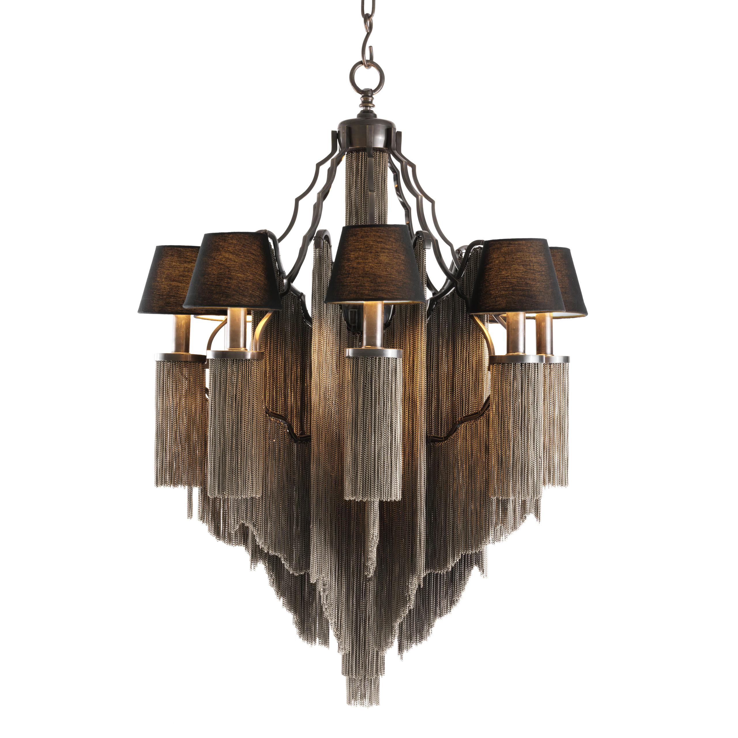
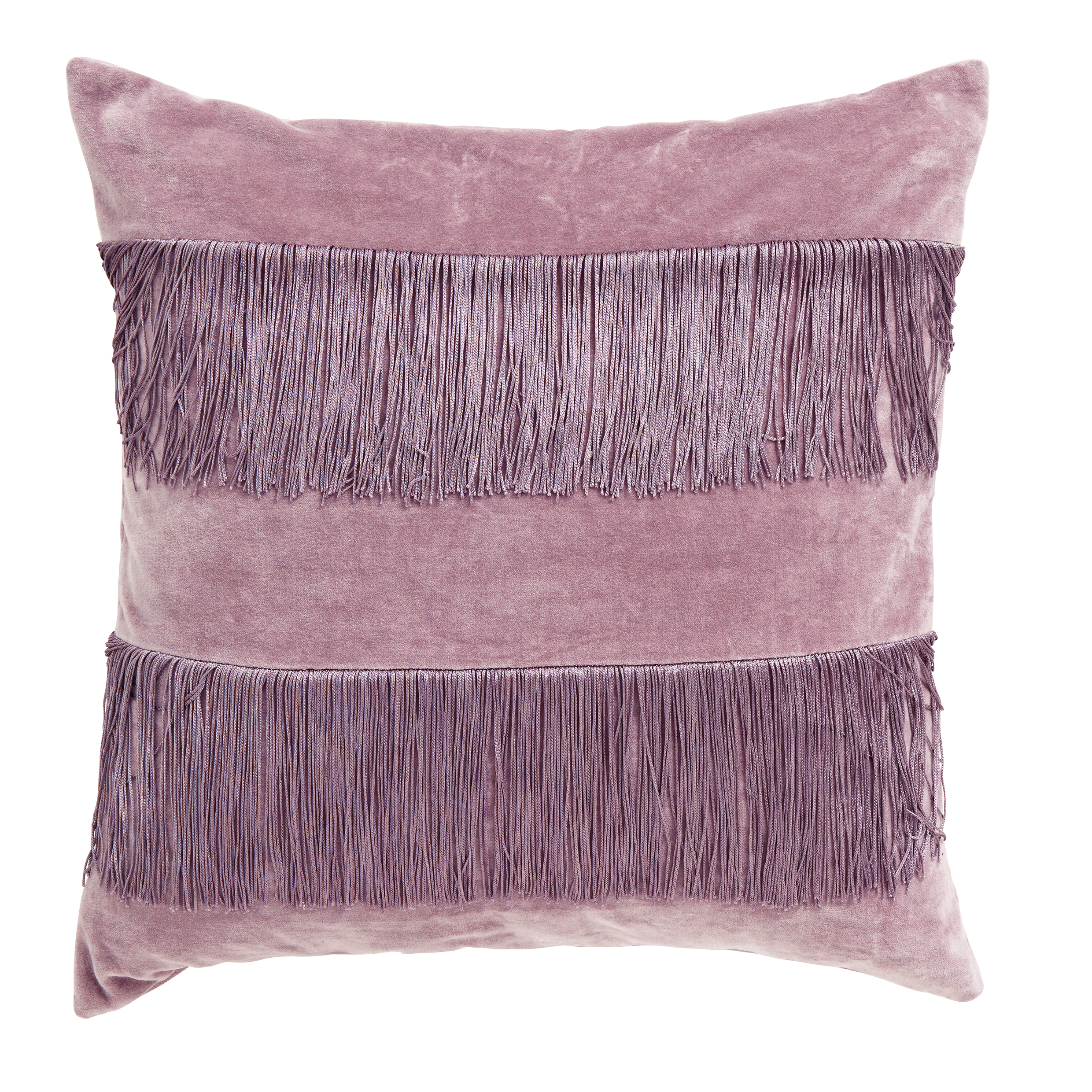
Fringe and tassels have recently made their way back into fashion, and this retro look is now making its way into our homes.
While the look may not be for everyone, the new version of fringing is definitely making waves in the interior design world in 2019. Whether it’s on lights, mirrors, or cushions, fringe can be a great way to add some fun and texture to sleek, minimalist spaces. Here are a few key ways to easily introduce the new fringing style to your home:
Pictured Right: Sevillian Sofa by Covet House
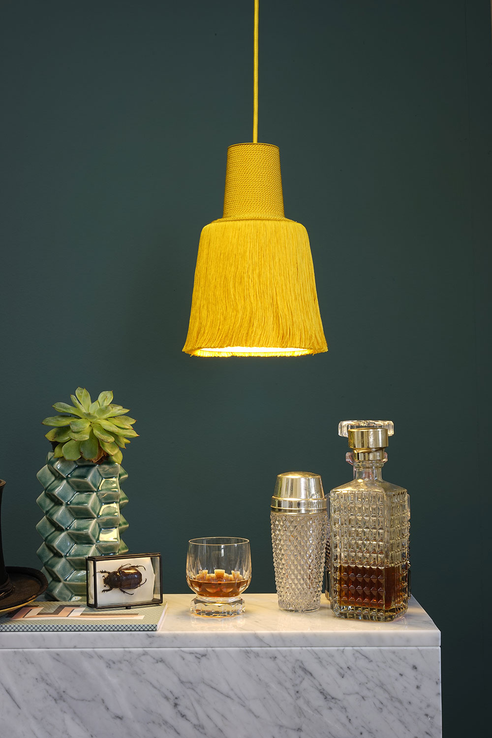
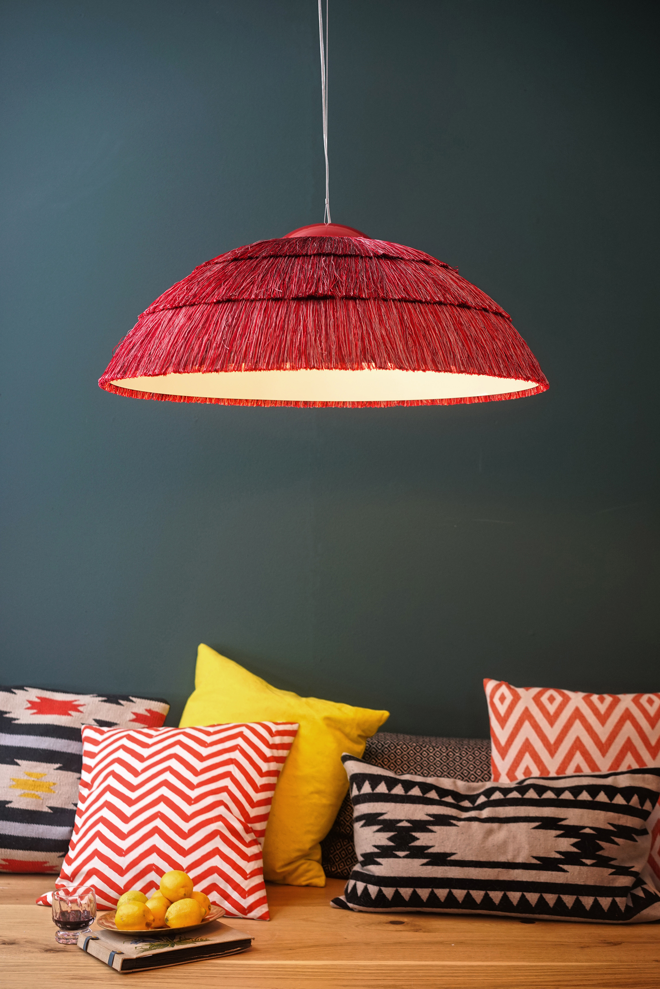
Lighting
Make a bold statement with fringed ceiling lights or even a fringed chandelier. For a more subtle look, a fringed lamp will add just the right amount of interest and texture to a gloomy corner of a room.
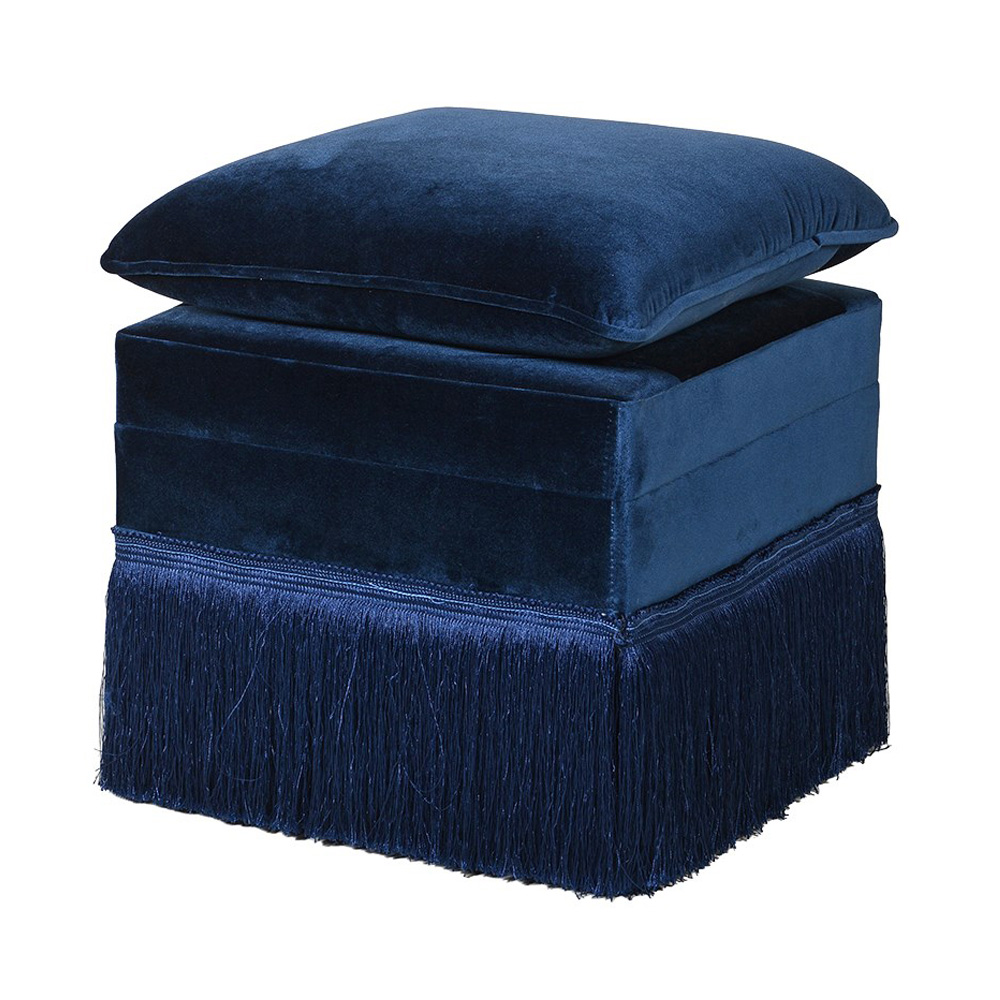
Furniture
Fringed furniture is definitely a more prominent retro look and will appeal to those who really want to embrace the trend and turn heads. Many furniture pieces can be ordered with a fringe added to the bottom such as sofas, footstools and chairs.
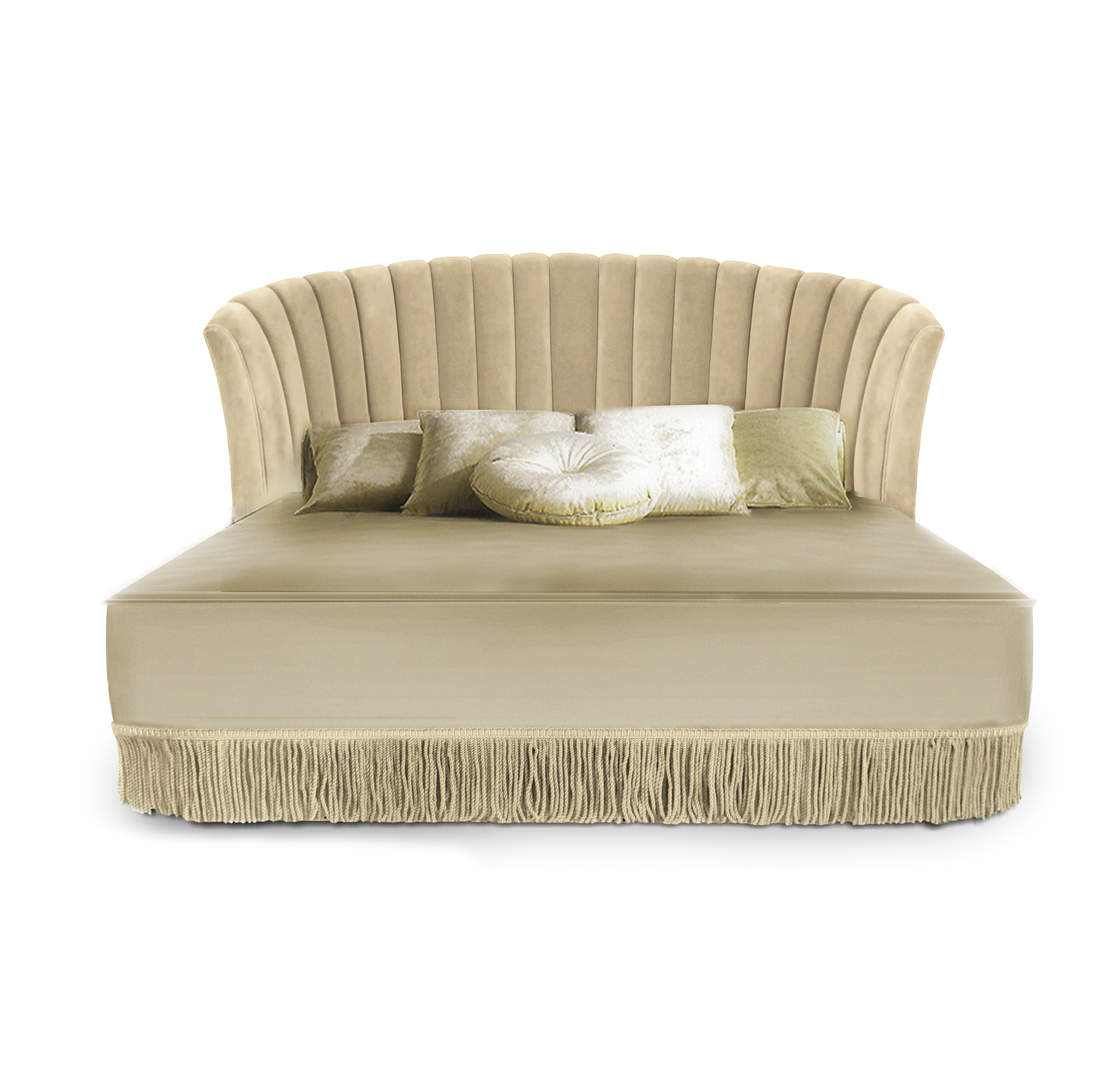
Sevilliana Bed by Covet House
Clipper by Amerigo Milano
Accessories
If you’re not ready to fully embrace fringe in your home, a simple accent or accessory can be the perfect way to experiment with the trend. Blankets, duvet covers and wall hangings are a few easy ways to add this trend to your home.
By AUDENZA
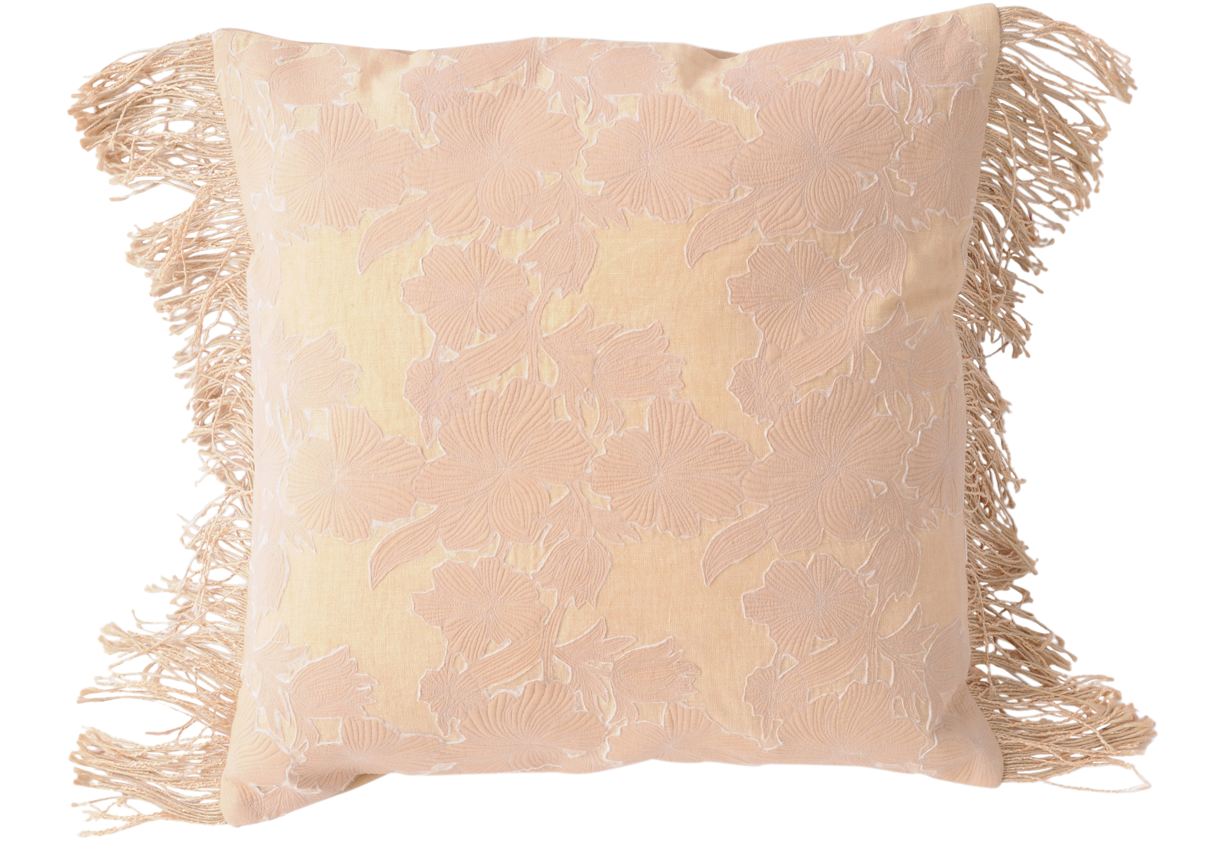
Pillows
Add a few cushions or pillows with a fringe to your space as a small introduction to the trend. Mix and match them with regular cushions. Fringes work well with a knitted texture and there are even sparkly and metallic options available.
A journey of an entire year must begin with a single step, and there’s a whole new exclusive crop of design trends to consider for 2019. For design company Boca do Lobo, a key note to keeping up with the upcoming 2019 interior styles is to believe that a room should never allow the eye to settle into one place, and to stay true to one’s unique taste. Something that is charming is never out of style.
For those with wanderlust and an earthy spirit, Boca do Lobo claims that 2019 is the year to express it. A pop of color has more personality than any neutral ever could, and there’s no limit to the number of routes that can be taken with vibrant tones and disarming styles. A sense of vitality and renewal, these are the several key aspects of the 2019’s upcoming trends.
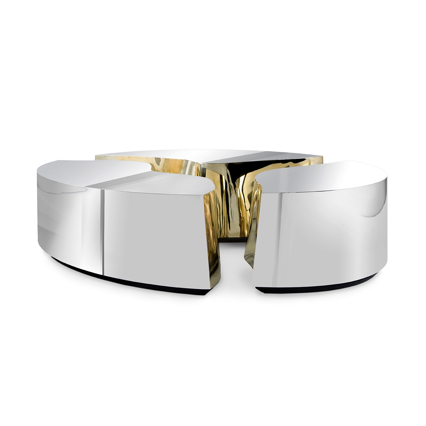
MIXING METALS
Rich metallic over sleek lines bring somewhat of a daring attitude to design. From chic silver, opulent golds and warm bronzes, the anodized surfaces are having its moment now, adding a dramatic flair to surroundings. Chrome arrives with 2019’s standout colors that embody the warmer spectrum of the color wheel.
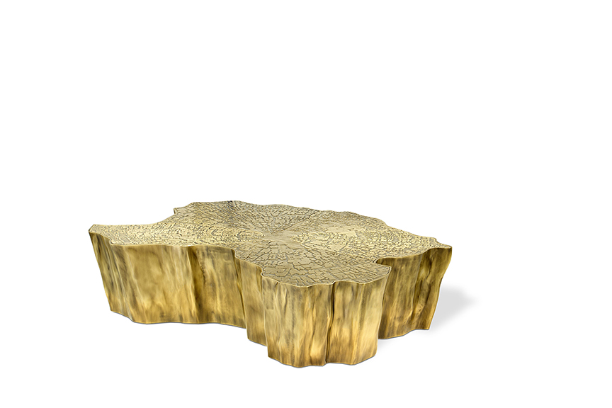
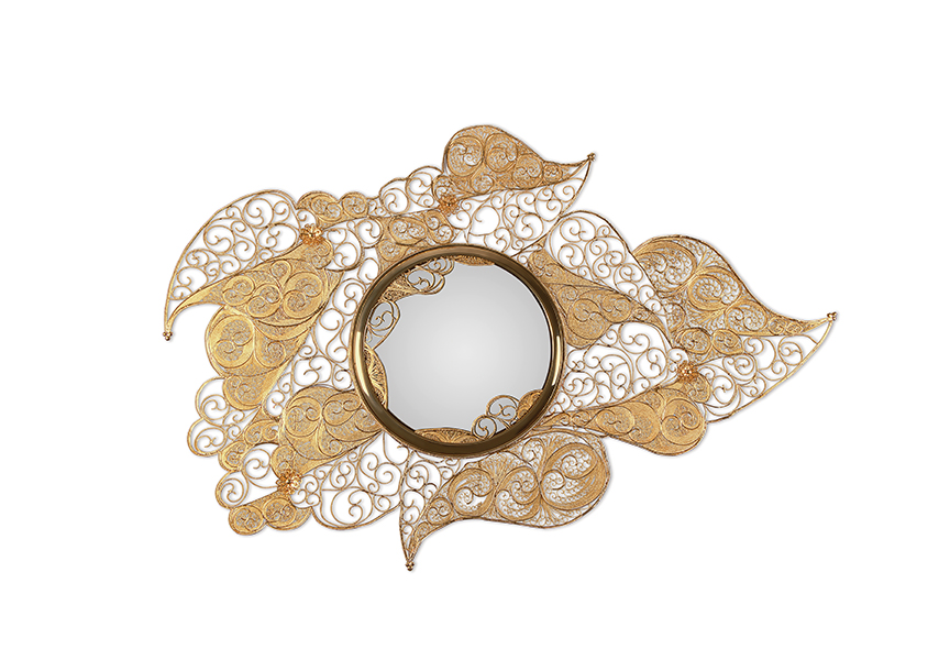
GOLD ACCENT
Glistening gold never goes out of style, and this year it is used on the most on-trend furnishings and accessories, giving a sense of opulence and refinement. Clever use of gold finishes draws attention to the beauty of material and its highly reflective qualities that sparkle in the light. Exquisite gold interiors are designed to show off such rich details.
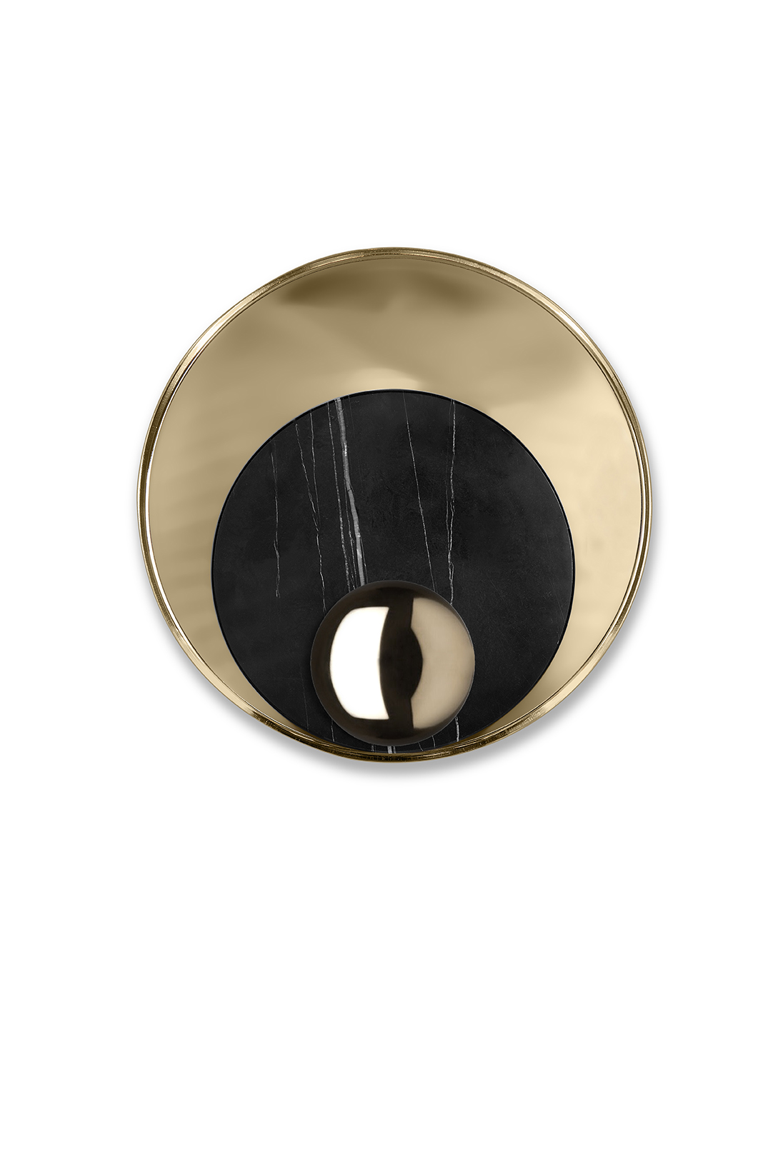
ROUNDED SHAPES
Popular in the ’60s, curved soft furnishings have now taken on interiors with a playful character. From seating to lighting, combining organic forms gives a contemporary atmosphere to the most elegant rooms. Faithful to nature’s movements and the futurist appeal, rounded shapes are one of the most intriguing and covetable 2019 interior design trends.
ANTIQUE & VINTAGE FURNITURE
Antiques have always held a value of their own but now they have found a new design role. From fascinating ancient times, distinct design pieces have re-emerged in a creative way to add a timeless touch. Designers have started to combine vintage furniture pieces with modern products and the result is unique interiors.
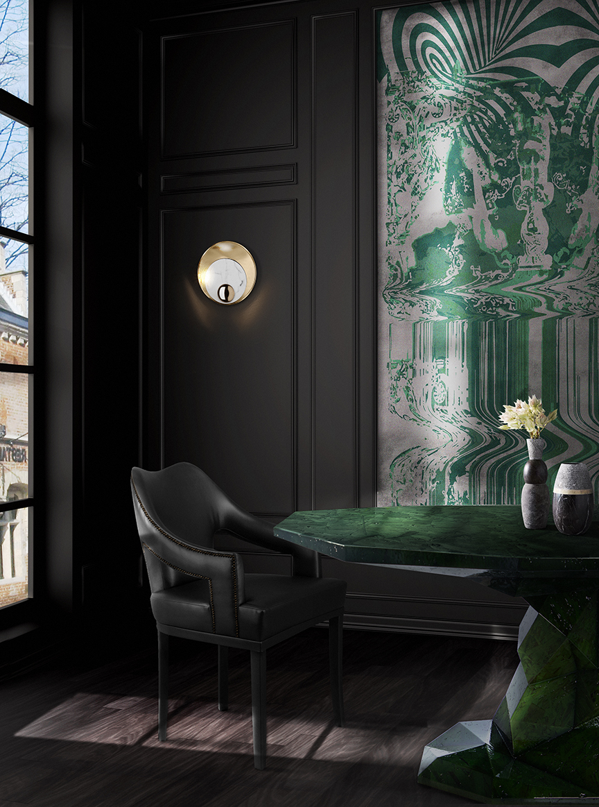
BLACK INTERIORS
To meet design lovers’ sudden demand for sophisticated ambiances, entire collections with black finishes are appearing in the market. With the emerging refined techniques, a certain lack of pretension lies within the functional design and emphasizes solid feeling along with cutting-edge style. Expect to see to seem monochromatic interiors dominating in 2019.
All photos courtesy Boca do Lobo.
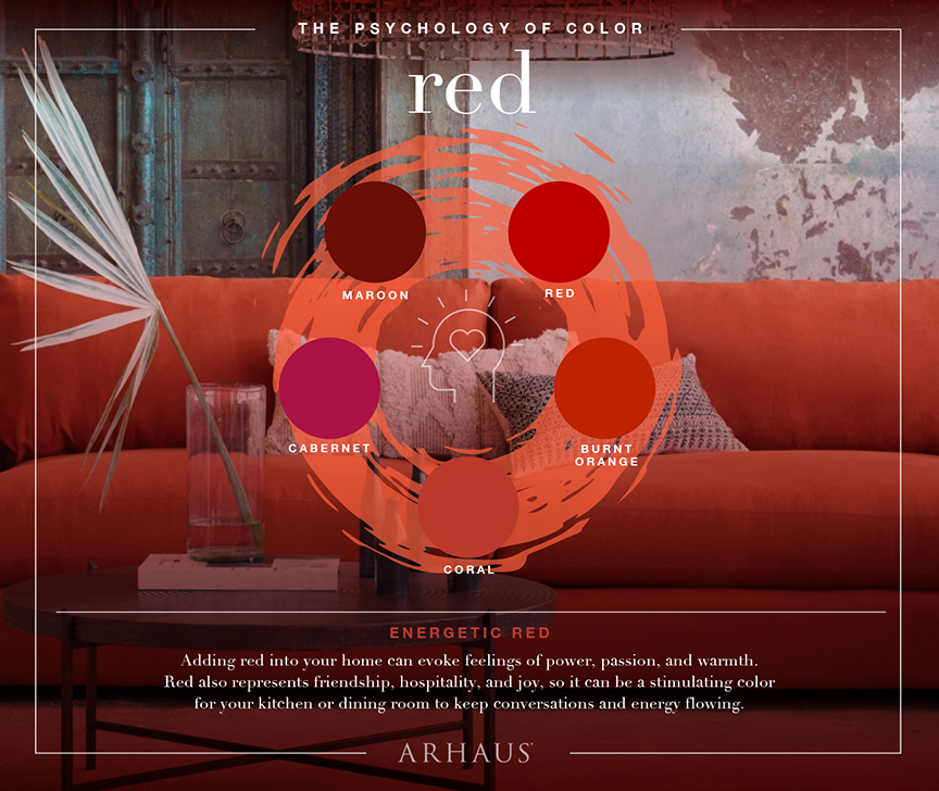
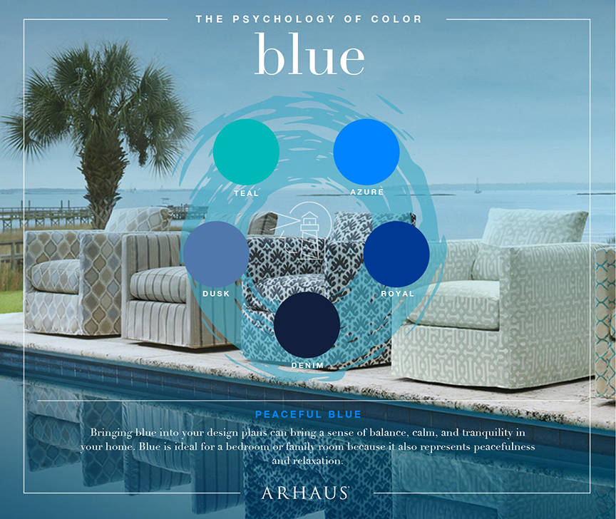
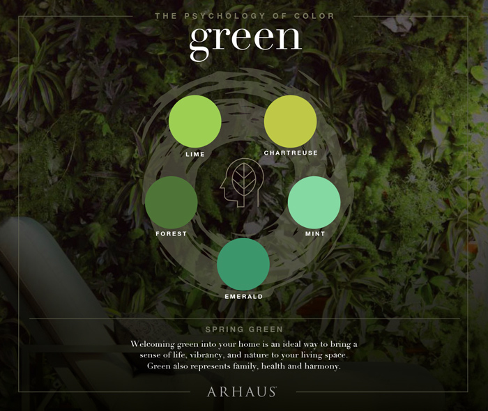
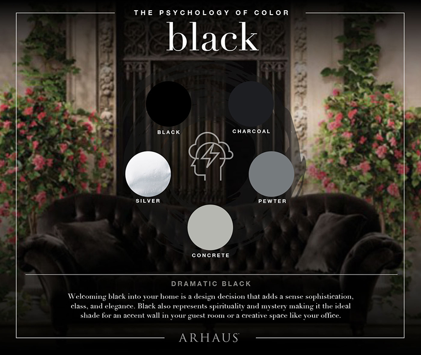
Whether you’re purchasing a new home or revamping your existing space, there are many different facets of decor theory to consider. One of the most important decisions to make is which colors you will utilize, a decision that will set the mood for your home. The savviest of designers and homeowners will consider the science of color, and further the psychology behind the way our brains interpret different hues and shades. When selecting a color scheme, it’s wise to understand the way these colors will make us feel. Whether working with shades of passionate red or warm tones of yellow, experts at Arhaus, an interior furnishing company, offer great tips on how to execute knowledge based on color psychology in interior design.
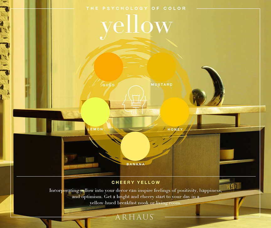
Start With Walls
Rooms with the absence of color, especially stark, white spaces with oppressive lighting, can make us feel uncomfortable. We have definitive reactions to color, especially on a subconscious level, so it is important to factor this in when deciding the layout and color scheme of room. Starting with the walls, try and think about the room’s intended purpose, and decide on paint color from there. Is this going to be a living room where the family relaxes as the long day is winding down? Or perhaps it’s a bedroom with a luxurious view of rolling hills or a coastline?
Due to the way that our brains process color, you will want to select a color that will promote a certain mood. Blues and greens can offer a feeling of relaxation, especially in rich, warmer shades. Blue is especially desirable in the bedroom as it can promote calmness and aid in sleep. Green traditionally is perceived as familial, which can be a great choice for a living room. Adding supplementary furniture, such as a patterned sofa or loveseat, can add to the mood of the room and help it become the ultimate room to spend time with the family.
Stock the Room
Surely, a chic and luxurious home will need furnishings; we can’t just live in an empty house! It is important to “stay within the lines” regarding furniture and decorative pieces. If you’re going for a rustic, mountain vibe, an abstract, post-modernist painting surely won’t pull the room together.
We can generally rely on our intuition when it comes to design, and when all else fails, go with pieces that you like! With that said, we must consider each item within the context of color scheme. Neutral colors, like browns, blacks, and grays, can be used to balance a room. Consider a brown or black exterior surface (especially fine cabinet wood), which can help to offset the color profile and bring the room a more subtle, cohesive look. A black bookshelf with matching end tables beside a deep burgundy wall can exude feelings of passion, warmth, and creativity – perfect for a den or a studio.
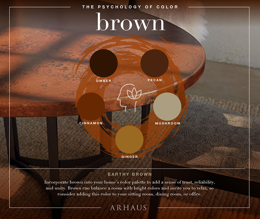
Finishing Touches
Once you’ve got the room essentially put together, with your color scheme well-solidified, it’s time to add the final touches and make it truly your own space. An excellent way to add a personalized element to your home is through old family heirlooms. Now, we’re not talking your grandmother’s prized Waterford crystal china, but an old quilt she made years ago can add a cool, retro feel to a room – while simultaneously honoring your family and heritage.
The same sentiment rings true for artwork, such as paintings or sculptures. A fine piece of art can add an element of sophistication and elegance to any room, but try to avoid heavy contrast between your room’s color scheme and the paintings! Once you’ve personalized your space and implemented colors you love, you will be ready to enjoy it for years to come.
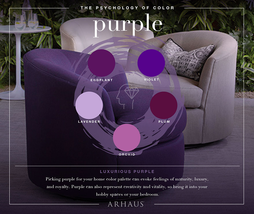
Imagery courtesy Arhaus.
10 Years Later
Our year-long look at what’s changed in U.S. luxury real estate since the 2008 recession.
When it comes to architectural styles and design trends, authenticity — not opulence — is what consumers want today.
Contemporary … modern … innovative … intentional … authentic … flexible … sum up residential real estate today. During the recession and early recovery, expectations focused on the “new normal,” what real estate and life, in general, would be like following such a seminal event. But real change is often subtle yet inexorable, and that is the story of residential architecture and design over the last 10 years.
After almost a decade, the much hyped new normal has finally arrived. Almost suddenly, it seems everything — architecture, design, outdoor connections, consumer attitudes — has been revamped in ways that entirely transform luxury homes. “It’s not just about how beautiful the building is, but what’s the experience. That’s a big evolution from where we were pre-recession,” observes Bruce Wright, AIA, vice president and principal at SB Architects.
Architecture
“Before the recession, I would say of the 60 to 70 homes we design a year, we would get one contemporary request and maybe a transitional request from clients. Now it’s flat-out contemporary. We’re talking flat roofs, pools on the roofs, outdoor screened rooms up on the upper levels,” says
Michigan architect Wayne Visbeen, AIA. “The resurgence of mid-century modern has also been a big, big part of our business.” Even when clients want homes that reflect regional architecture and connections, he says, “it’s with a contemporary edge, definitely with more simplicity and less frou-frou.” Visbeen’s firm works in 48 states and 10 countries, and he sees the move toward contemporary, notably a warm contemporary, playing out nationwide. Also in demand, even in locations as diverse as Beverly Hills and Miami, is an interpretation of contemporary dubbed “modern farmhouse.”
In the South, Stephanie Gentemann, AIA, a partner at g2Design in Savannah and director of Palmetto Bluff’s design review board, a transitional aesthetic, which she sees as a blend between contemporary and traditional, is gaining prominence. Gentemann also sees modern farmhouse garnering interest. Preferences for contemporary, transitional and modern farmhouse are not restricted to upscale homes, but range across all age groups and income levels.
For luxury, Gentemann says, “The more expensive the house, the more eclectic we get in terms of architectural style. There isn’t one predominant style that I see that is dictated by price point.”
©2018 Ciro Coelho / CiroCoelho.com
“What we see now is driven by a better- educated consumer. We’re seeing an appreciation for contemporary architecture with a warm material palette that is accessible and friendly, but not thematic, that is not an interpretation of another culture. It’s really about creating this kind of transparency, layered architecture that has rich materials and more materials communicated in a more contemporary format,” says Wright.
“I think it’s an interesting place where we are design wise,” says Ken Bassman of Bassman Blaine Home, who helps owners turn Montage residences into dream homes in Maui. “People want things to be more streamlined, clean and neutral. But it doesn’t mean that it’s bland or boring. There’s actually more color with artwork,” pillows and accessories. Wall coverings are back along with textural finishes and even a touch of glamour.
On the Big Island, designer Gina Willman says, “everyone is looking to ‘lighten and brighten’ their surroundings. We are lightening up walls by plastering or painting with hues significantly brighter than the ‘50 shades of beige’ phase of the 2000s. New homes are exploring lighter wood tones and cabinets.”
Revamped Interiors
Exterior architecture and elevations are only one transformation for homes. Inside, floor plans are being revamped as interiors undergo substantive alternations. “If I pull out a floor plan from 10 years ago, it would seem like a total disaster. There are things we would never do now,” shares Chris S. Texter, AIA, a principal at KTGY Architecture + Planning.
Open floor plans continue to define interiors. Living rooms are passé, often replaced by smaller rooms owners can configure however they want. And the jury is still out on separate dining rooms. James Rill, principal of an eponymous Washington, D.C. architectural firm, says dining rooms are often designed for alternate or dual uses such as a library.
Open plans are evolving to be more functional and nuanced. The intentional piece in open-concept design, observes Chicago designer Mary Cook, is the way these spaces are “high-performing, multitasking and they share their functions across rooms. People want the spaces to live better; they just don’t want to fill empty space.”
A variety of materials, warm hues and stone are contemporary hallmarks as shown in the Marmol Radziner designed inspiration home at Ascaya in Las Vegas.
Photo courtesy Boulderback 5.
Currently a dining room, this space is equally adaptable as an office, studio or play area. Pocket doors add to this versatility without interrupting the flow.
©David Tonnes dba. PanaViz Photography / Courtesy of Ken Bassman
Open to Innovation
Even in large homes, Visbeen says his firm looks for opportunities for more creative uses and more innovation. “If I had to say anything was the real trend, it would be innovation for us.”
“Creating spaces where the kitchen, living and dining all seamlessly merge together supports a more contemporary style of architecture,” Wright explains, adding, “we are doing it on a grand scale, but also in an intimate way to help support the cadence of a daily routine.”
Kitchens, particularly in upscale homes, capture even more square footage. “People are spending a lot more money in their kitchens,” says
Pamela Harvey, owner of Pamela Harvey Interiors in Washington, D.C.
In lieu of luxury mainstays such as Wolfe or Viking, many opt for even higher-end appliances including La Cornue, AGA and Bertazzoni. Colors are another growing preference for both cabinetry and appliances. And clients now want range hoods to be powder coated to match the cooking appliance. What’s trending for colors in kitchens is dark blue, Harvey adds.
Pantries are back and are more like those from 100 years ago. “Pantries are taking on a life of their own,” says Texter, referring to the need for more storage along with additional functionality in kitchens. Open-concept designs mean the kitchen is always on display, so back kitchens or a second kitchen area tucked out of the way (once a nice-to-have amenity) are now a luxury “must-have.”
They can range from an expanded pantry with additional counter space to corral counter clutter to a fully outfitted butler’s pantry, which at the highest price points might morph into a full-on catering kitchen.
More square footage is devoted to kitchens and pantries.
Photo by Stacy Zarin Goldberg / Courtesy Pam Harvey Interiors
New Connections
One of the most transformative changes in floor plans, the orientation of kitchens and great rooms and the experience of the home overall, comes from the way interiors now relate to the surrounding landscape. “Outdoor living spaces are an enormous part of our business and have been for years, but it has taken an even greater level,” observes Visbeen.
Ten years ago, outdoor living referred to patios, gardens and decks. Today, thresholds are blurred, and the division between inside and outside is almost nonexistent. “It used to be enough to have a sliding glass door or a French door that went to the backyard. And now it’s about how that indoor space expands and takes advantage of the fenestration. Then, there is the desire to have a room outside, and that wall just disappears, and the space doubles in size,” says Texter. “Now we’re practically designing the backyard to go with the home. That space is part of the home, and the design is integral.”
New technology is also a catalyst for this transformation. The cost of large windows and disappearing doors is much lower than before the recession. New products include more sizable expanses of glass, broader doors, doors that pivot, and windows and doors that wrap around corners, greatly expanding options to integrate inside and outside areas, visually and literally. Having sightlines that directly extend to an outside patio or room visually expand smaller rooms.
Metal frames also mean less weight and larger panes of glass, according to Rill. In traditional homes, renovations and additions almost always address the indoor/outdoor synergy. Rill says they use metal framed glass more frequently and, in some rooms, disappearing doors are replacing sliders and French doors. “People are moving toward something that’s a little sleeker, a little cleaner and a little more playfully modern, but still within traditional proportions and shapes.”
Today, thresholds are blurred, and the division between inside and outside is almost nonexistent.
©David Tonnes dba. PanaViz Photography / Courtesy of Ken Bassman
Authenticity, Not Opulence
A decade ago, luxury homes were often considered a testimony to status, and ostentatious demonstrations of affluence were acceptable. “During that era, it was in vogue that the more money you spend, the better it was. And after the recession, people came away from all of that. That heavy, goopy, layered, gilded aesthetic just evaporated. There was this yearning for authenticity,” explains Cook.
“Because of knowledge and images and travel that people are exposed to, they are more willing to be authentic to what they want instead of what is considered the norm. Also, people are moving away from that and it’s become more about what they want in their home and how they want their home to feel,” says Harvey. “They want their home to reflect who they are, whether they have a designer help them get there or not.”
Are homes getting smaller? Yes and no. Overall home sizes have seesawed since the recession, according to data from the National Association of Home Builders, but designers say how a space functions and is finished trumps size. “People are rightsizing more, so we’re seeing higher-end finishes in smaller square footage and the desire to use rooms more efficiently,” says Visbeen.
Rightsizing might be a trend, but signs that home sizes are beginning to creep up — especially for luxury properties — are prevelant. Since the recession, Gentemann sees the range of home sizes expanding. “Not only are there smaller homes, but larger homes as well.”
What has changed is the way additional square footage is used. “As square footage is going up, the walls are coming down and those spaces are opening up to each other. So those core areas where people come together are most important; I think what’s driving that is the casualness of life today and wanting to be able to come together,” explains Cook.
“People are looking for a graciousness of space, which is different than size,” says Ann Thompson, senior vice president of architecture and design at Related Midwest. “Consumers are very savvy now in a way we didn’t see 10 or 15 years ago. I think people are much more cautious and careful in their decision making. They are really assessing value.”
In the higher end, the more affluent the buyer, the more astute they are. “These are people who are very accomplished in their own field, and often that means they’re great decision makers. They’re researchers; they educate themselves about things in their life that are important to them and certainly their home is one of the most important decisions that they make,” shares Thompson.
Homes Are Resorts, and Resorts Are Homes
Increasingly home is seen as a refuge, a place to regroup and connect with families, which means primary homes are becoming more like resorts. Following resort trends, wellness is growing as a desired attitude, which means exercise spaces, a high level of air and water purification, steam showers and saunas are all desired amenities. “I think the overall trends in hospitality design and high-end residential continue to be largely influenced by travel, social media and the accessibility of high-end design that is reaching the consumer in general. There is a continual elevation of expectations,” shares Wright. On the other hand, second homes are becoming more like primary homes, with larger master closets and the addition of any needed features to equip the homes for year-round living. Offices are also another potential addition, as are larger kitchens.
Also, sustainable and energy-saving features, along with smart home technology, are no longer amenities. Rather, they are expected. Looking ahead, designers have a raft of features they see as most desirable. They include: hidden rooms, gun safe rooms, his and hers master baths, diverse wine storage areas, multiple detached structures, storm preparedness, backup generators, outdoor living on multiple levels of homes, and future elevator shafts. One innovative use in a Palmetto Bluff home, until the elevator is required, is to convert the space into a climbing wall, which keys into Visbeen’s observation that innovation might be the overarching trend.
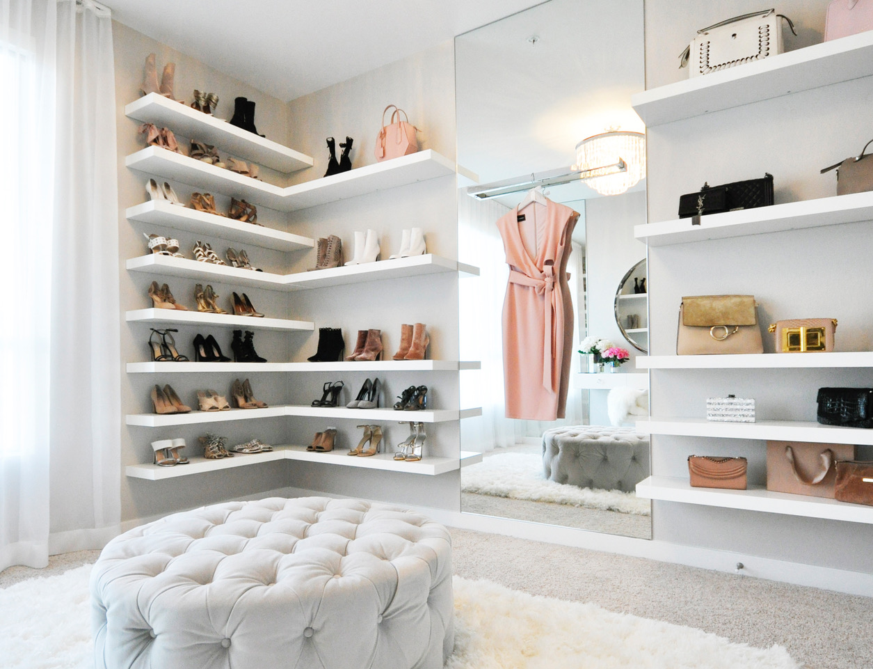
The closet is becoming one of the most important spaces in the house, and creator of LA Closet Design Lisa Adams is transforming closets every day. Luxury closet design company, LA Closet Design, launched in 2007 and intended to revamp the concept of closets. Since then, a lengthy list of celebrities, designers, architects and homeowners seek services to create customized, often high-tech and environmentally friendly, wardrobe spaces that add real value to the home. Adams decided it was time to reinvent the closet into a space that is functional, organized and stunningly chic.
Adams is now a celebrity go-to luxury closet designer, with clients like Khloe Kardashian, Fergie and Christina Aguilera. Recently, she created a carry-on luggage line called LAMove Mobile Closet — a closet on the go — and launched popular lifestyle blog CLOSETPHILE. Her clients reside across the U.S., Europe, Dubai and more. Here are some top closet trends, according to Adams.
Staging Areas
“These are a must in any dressing space today!” said Adams.“Whether it’s as simple as a wall-mounted rod or a freestanding display area, a staging area allows for easy styling and is the perfect spot to snap away and share on social media.”
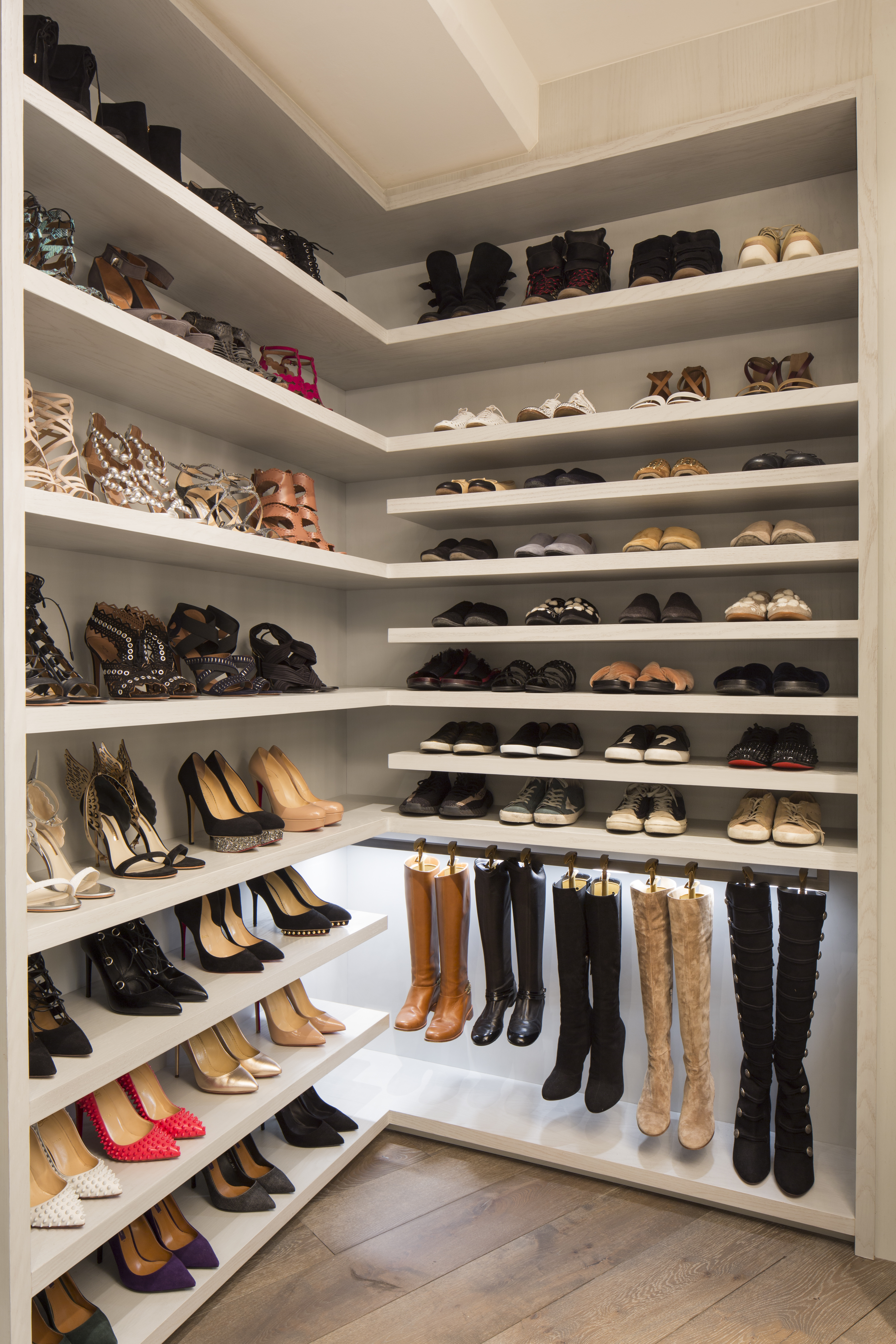
Shoe Walls
Nothing says #closetgoals like a floor-to-ceiling display showcasing all your shoes. “Increasingly, clients are putting the pumps on display and keeping them styled to perfection,” said Adams. “You can organize by style, color or occasion, and the wall becomes the perfect backdrop for all those enviable Instagram moments!”
Lighting
Luxury closets are taking notes from luxury retail when it comes to lighting, with the addition of backlit shelves and illuminated displays to add a wow-factor to any space.

Multi-Functional Rooms
“As more millennials enter the housing market, spaces will become more flexible and multi-functional, challenging the conventional notion of the closet,” said Adams. “We will continue to see closets, along with every other space in the home, adapt to this more informal lifestyle. You no longer need a whole room dedicated to your desk, while your wardrobe suffers in a crowded walk-in; instead, these spaces become one.”
Photos courtesy of LA Closet Design
Making an iconic design statement in a minimal aesthetic, the Dawn to Dusk lighting fixture is the newest product released by the award-winning London-based design studio haberdashery that invites you to experience the magic of sunrises and sunsets from right inside your home.
The intricate design was inspired by the “the memory of the sun” and creating a strong connection with this memory, according to Ben Rigby, creative director and co-founder of haberdashery.
“We want to reach beyond the industry’s current expectations for a lighting product and push for a more ambitious blend of quality, creativity and narrative-driven design all wrapped up in an iconic, useful and aesthetically beautiful design statement,” says Rigby.
To do this, Rigby and other designers chose to work with an uncomplicated design to demonstrate the clarity of a rising sun, as well as identified the perfect color range that would create a strong, emotional resonance.
Available as a table and floor-standing lamp, the diffused circular light source explores a palette of warm colour hues during its transit of the vertical stand, delivering these as direct light, or as a flood of light on a wall.
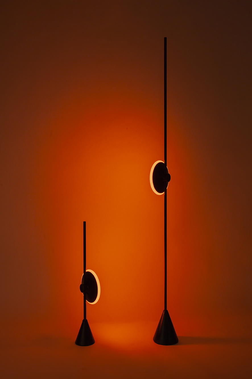
When at the base the sliding light head sits in an off position, and then as it is moved upwards it activates a low intensity red hue, which transitions into orange, then 2700k white light as slid upwards. This custom LED light array, developed by Rigby and his team, replicates the transition of light from the deep, rich red of the late evening to the white light of midday. The light is also capable of rotating 360 degrees around, providing a range of uses from outward facing task light through to a backward-facing ambient light, creating a subtle wash.
Dawn to Dusk is meant to not only showcase a naturally beautiful occurrence but to also utilize this power to support our natural rhythm throughout the day. The high-quality white light helps users to wake up more naturally, while the richer, relaxing red colors help regulate the circadian cycle and prepare for sleep.
“haberdashery believes light is a transformative power in the world; we challenge what is possible with light, and through our products are defining a new category of contemporary lighting,” says Rigby.
All photos & video courtesy haberdashery.